
SingleStore has a long tradition of sharing details about its efforts to optimize performance in order to help customers get the most out of our products and contribute to our efforts to optimize performance further. This blog post, from recent SingleStore intern Brian Chen, continues that tradition.
I interned at SingleStore last summer on the team that developed SingleStore Studio, a new product which provides a friendly interface for monitoring and managing SingleStore clusters. The main focus of my work was Visual Explain, a tool that helps customers optimize their database schema for maximum performance, and that also helps SingleStore engineers discover bottlenecks and improve the operations of the core SingleStore engine.
In this blog post, I’ll explain how and why Visual Explain was developed and how we worked to optimize information display. I’ll also share the key resources we drew on to help us make development decisions.
How We Worked
The team that developed SingleStore Studio is quite small. There were two engineers, myself and SingleStore software engineer David Gomes, and two designers. Our team lead, Carl Sverre, and other members of the platform team stepped in regularly to review code.
The upside of the small team size was how closely we could work together. For most Studio features, the designers would first make mockups, then present them to the rest of the platform team during a design sync meeting, which happened twice a week. All of us could provide feedback and discuss alternatives; I learned a lot about design through these syncs.
When a design was finalized, Gomes and I would implement it, occasionally making some judgment calls about consistency or the workings of animations that weren’t fully specified in the design. I was also able to shadow some user tests, where we recruited outside participants to try using the functionality we created, to help us discover usability problems.
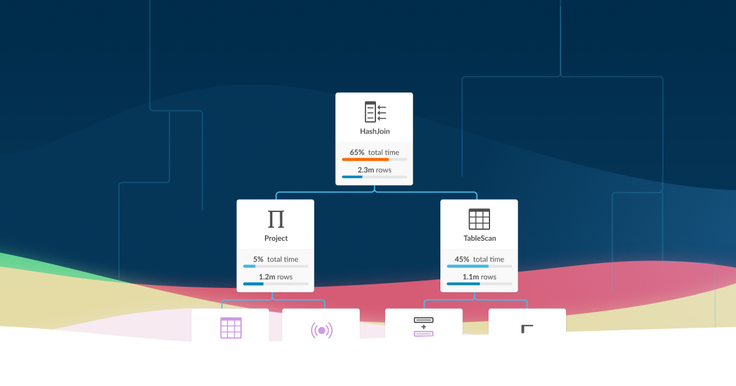
The Studio feature I worked on the most, Visual Explain, is needed as part of the bread and butter of what we do at SingleStore, which is making queries run fast. To make a query faster, it’s important to know what operations the database engine is performing behind the scenes to execute it. Our customers can use this information to figure out whether their database schema is optimized for the query, and improve it for better performance; our database engineers can use it to discover bottlenecks and improve the engine’s operations.
Like other database engines, SingleStore provides this information as the output of EXPLAIN or PROFILE commands. Unfortunately, the output of these commands is a giant blob of text, with lines that are hundreds of characters long, decorated with a tiny dash of ASCII art — not exactly easy to read. So we developed Visual Explain as a tool for displaying the output of the EXPLAIN or PROFILE commands graphically, in a way that humans can interact with and understand.
Starting Visual Explain
The concept of “prettyprinting” the operations of a database engine certainly isn’t original. For example, Alex Tatiyants’s Postgres EXPLAIN Visualizer (Pev) is a similar tool for Postgres queries. Pev influenced the design of our tool a lot. At SingleStore, we’ve had an internal tool called PlanViewer, which is also a past intern project.
Our goal with Visual Explain was to build something that was similar to these existing tools, but that would be further optimized, and that would fit in with the aesthetics and functionality of the rest of SingleStore Studio. We also wanted Visual Explain to be able to handle very complex queries, as well as gracefully accommodate changes in the SingleStore engine’s EXPLAIN or OUTPUT format as much as possible.
We started working on Visual Explain by writing and reviewing a detailed 20-page technical design document. Since Gomes works remotely from the rest of the Studio development team, in a different time zone, it was really important to have a design that allowed us to work on implementing different parts independently. To accommodate this, we split Visual Explain up into discrete components and carefully documented the interfaces between the components with Flow types.
This process allowed us to quickly write placeholders for each part so that we could later replace each placeholder with a unit-testable implementation. The tool’s user interface and appearance also required a lot of thoughtful design, so the design team spent many days coming up with a complete mockup that included details for every node and interaction in Visual Explain. They designed the interaction down to the last icon and progress bar color, and we spent a lot of time discussing each decision and different aspects of the implementation during our design syncs.
Creating the Layout Algorithm
The component of Visual Explain that I spent the most time on was the layout algorithm. The structure of an EXPLAIN or PROFILE output is a tree of nodes, each node representing an operation. In Visual Explain, we wanted to display this tree graphically.
The question seems simple: given a tree, how do you lay out its nodes in a 2D plane as to show the tree’s hierarchical structure in an intuitive and aesthetically pleasing way? This turns out to be a problem with a rich history.
It’s easy to draw a specific tree on a piece of paper in some way or another that looks nice. However, it’s not at all obvious how to objectively describe what a nice tree drawing looks like in general. It’s even less obvious to know how to write an algorithm to do this.
Fortunately, there are quite a few papers that tackle the tree-drawing problem. One such paper, published in 1981 (more than 35 years ago!) but still widely cited, is Reingold and Tilford’s Tidier Drawings of Trees (PDF). In this paper, they propose four aesthetic criteria for drawing “tidy” binary trees, and suggest an algorithm for producing drawings of trees that satisfies these criteria while producing drawings that are reasonably narrow, for onscreen display and print.
The criteria are:
- Nodes at the same level of the tree should lie along a straight line, and the straight lines defining each of the levels should be parallel.
- A left child should be positioned to the left of its parent and a right child to the right.
- A parent should be centered over its children.
- A tree and its mirror image should produce drawings that are reflections of one another; moreover, a subtree should be drawn the same way regardless of where it occurs in the tree.
The problem and algorithm were generalized to trees of arbitrary degree, but still with ordered children, by Walker in 1989 (PDF), and Walker’s algorithm was improved to linear time by Buchheim et al. in 2002 (PDF). This is also the algorithm that the D3 layout editor uses to render trees, by the way.
If you are looking for an overview of the subject, the introductory sections of the paper by Buchheim et al. are well-written descriptions of the earlier algorithms, their requirements, and their shortcomings. Bill Mill’s article, Drawing Presentable Trees, provides an even more complete history of this problem and solution attempts, with code, starting from Knuth (of course it’s Knuth) in 1971.
Finally, I should mention Kennedy’s Drawing Trees (1996), which describes how to satisfy the aesthetic criteria functionally, using simple SML. Although the algorithm, as presented in the paper, is not linear time, it is nicer to work with.
Note that all of these papers concern drawing rooted trees in which siblings are ordered. The problem of drawing arbitrary graphs in aesthetically pleasing ways has a different history altogether. A standard algorithm for this problem is given by Gansner et al. (1993), which is used by graphviz’s dot drawing-output tool and the JavaScript library dagre, among others.
Fine-Tuning the Implementation
However, it turns out that a lot of the aesthetics aren’t directly applicable to our use case. Rules 2 and 4 are unobjectionable. Rule 1 is broken by Pev’s layout, and we also chose to violate this rule.
The reason is that, for our use case, it usually isn’t meaningful to know if two nodes are on the same level if they aren’t direct siblings. Nodes in the output of EXPLAIN and PROFILE and their relationships with their children can be drastically different. What’s more, some of our nodes have different heights: for table scan nodes, we add the name of the table on the bottom of the node, making it taller. For us, enforcing that nodes on the same level should be vertically aligned could actually suggest a misleading uniformity among those nodes.
Pev also breaks Rule 3 by centering a node over the bounding box of the subtree underneath it, as a natural consequence of its DOM structure. This aesthetic makes sense if you prefer to visualize nodes as the roots of the entire subtree underneath them, rather than the parents of their direct children. (Incidentally, given Pev’s other choices, this is equivalent to being centered at the weighted average of the children, where each child is weighted by the number of leaf nodes it has as descendants. This suggests some ways to interpolate between this strategy and Rule 3 — for instance, you could take the average of the children weighted by the square root of the number of leaf nodes under each child.)
The preference for narrow drawings is also generally applicable, but we have to trade it off against clarity. We have a lot of information we want to display in our nodes. As a result, we can’t devote as much space to drawing the edges. So, instead of drawing edges as straight lines directly from node to node, we draw horizontal and vertical connecting lines like Pev. (By comparison, in the drawings in Reingold and Tilford’s paper, adjacent nodes are so far apart that you could fit additional nodes between them.)
The downside of our approach is that edges, or their absence, become easier to miss compared to the detailed information in nodes. So to avoid confusion, we may not want to lay out nodes too close to other nodes they aren’t connected to. Therefore, we heuristically add additional whitespace between some subtrees, albeit at the cost of making our trees wider.
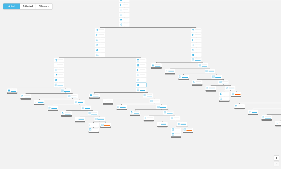
Here’s an example of a subtree with horizontal and vertical connecting lines laid out more or less directly following Walker’s algorithm:
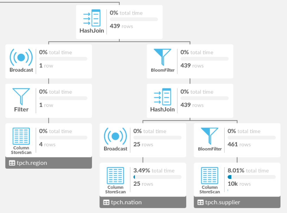
The ColumnStoreScan, Broadcast, and BloomFilter nodes on the fourth row are aligned, but they aren’t strongly related. They just all happen to be two nodes away from the root of this subtree, but those two nodes are totally different between the ColumnStoreScan and the other two nodes. In addition, the HashJoin is centered over its children rather than the subtree.
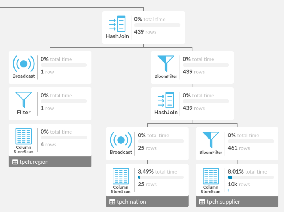
Here’s the Visual Explain layout as I ultimately implemented it. We’ve made the brackets between a parent and its multiple children taller than the line between a parent and its only child, and added space between the left and right subtrees, which separates the ColumnStoreScan from the Broadcast and BloomFilter that used to be on the fourth row vertically and horizontally. We’ve also centered the HashJoin over the subtree rather than its children. I think that the method you prefer for centering a parent over its children is really a matter of personal taste, but the separation between subtrees helps clarify the structure of the tree on a quick glance.
Note that Pev draws a tree essentially by arranging the subtrees in a row, so that their bounding boxes do not overlap. While this layout algorithm has the virtue of being extremely simple (it is actually a natural consequence of the way Pev’s DOM is laid out), it often creates drawings that are significantly wider than necessary.
Here’s an example of what Visual Explain output would look like if we specified that subtrees’ bounding boxes should not overlap:
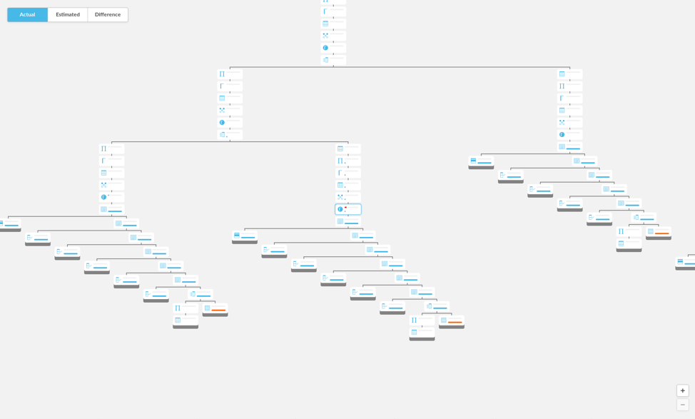
And here is the same area of this tree laid out using, roughly, Walker’s algorithm, allowing us to fit more nodes on screen:
In the particular PROFILE output that is partially depicted above, which has 317 nodes, shifting the subtrees together made the diagram narrower by about 20 percent. There is still room for tweaking here; perhaps, for instance, it is still better to keep a wider horizontal or vertical gap between faraway subtrees for clarity.
Having said all that, the ultimate layout algorithm I wrote still very much uses the general strategy of Walker’s algorithm. Namely, when drawing a tree, it draws each subtree underneath the root independently, horizontally shifts the subtrees away from each other until there is enough space between every pair of subtrees, then positions the root above the subtrees.
This strategy, and many of the optimizations proposed to use it, are just as applicable even if parents are not centered over their children, if nodes in different subtrees are not horizontally aligned with each other, and if we want to use more complex heuristics to decide how much space is “enough space” between subtrees. (My algorithm requires more space between subtrees that are wider; to enforce vertical space, it treats the bounding boxes of leaf nodes as taller than they actually are.) It also still uses Walker’s idea of evenly distributing additional space when shifting non-adjacent subtrees away from each other, which spreads out small subtrees nicely.
The caveat to all this is that my layout algorithm is not linear time, but this turns out to be perfectly acceptable. A reasonable quadratic implementation can already handle thousands of nodes, and above that point, around the upper limit of reasonable EXPLAIN/PROFILE sizes, rendering the nodes in the DOM becomes just as important to optimize.
Further optimizing the layout algorithm would make it harder to tweak the various heuristics I mentioned. Nevertheless, even with our differing aesthetic goals, nearly all of the optimizations proposed in the various cited papers could still be applied to make the algorithm linear in the number of nodes, if we find the need in the future.
Visual Explain has now shipped, as part of SingleStore Studio, and I’m excited to let our engineers and customers use the tool to visualize the operations behind their queries.
Brian Chen, the author of this blog post, is a senior at MIT and has interned at Dropbox. He worked on SingleStore Visual Explain, part of SingleStore Studio, this past summer. – Editor
For more information on SingleStoreDB Self-Managed 6.7, see the press release and all eight blog posts on the new version: Product launch; managing and monitoring SingleStoreDB Self-Managed 6.7 (includes SingleStore Studio); the new free tier; performance improvements; the Areeba case study; the Wag! case study; the creation of the Visual Explain feature (this post); and how we developed adaptive compression.


